It would be nearly impossible to work in the data science and business intelligence (BI) space without coming across the seminal Visual Display of Quantitative Information, and other works by Edward Tufte. Many of us refer to these books as the holy texts of visualization design, as there seems to always be a section to guide us through a particularly challenging data communication problem. I recently began my perennial re-read of Tufte’s content and cataloged a handful of key insights throughout his writing. These are practices that I find myself using frequently and hopefully they are as useful to you. You’ll also note a selection of Tufte’s poignant quotes in each section to give you something to ponder the next time you’re asked to make a pie chart. Without further ado, let’s begin with…
A picture is worth a thousand words:
“When you can’t communicate your message effectively through words, use pictures and graphics.”
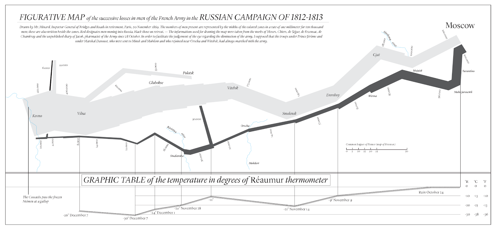
Often, technical descriptions of an analysis can become verbose and filled with jargon; complex analyses and datasets are especially prone this problem. While it is important to document how an analysis was conducted, written documentation alone can obscure the insights of the analysis itself. Of course this is not what we intend as data scientists, however it is easy to forget that not everyone (laypeople and technical audiences alike) is as absorbed into the nuances of a particular set of data points as we are! Because a purely written representation of an analysis is generally not sufficient to convey ‘the gist’ of what that analysis is trying to achieve, we should consider a thoughtful graphic as a necessary condition to accurately communicating our data and properly engaging our audience. Pictures can greatly aid our storytelling, as exemplified in Minard’s representation of Napoleon’s march on and retreat from Moscow. The data story of this historic event could surely be conveyed through several chapters of writing, tables, bar charts, and maps. Instead, Minard devised an ingenious way to condense a majority of this data story into a single chart (show below). This chart, accompanied by a brief descriptive paragraph, manages to tell a story of geographic space, winter temperatures, military strategy, and the attrition of Napoleon’s Grande Armée.

FIGURATIVE MAP of the successive losses in men of the French Army in the RUSSIAN CAMPAIGN OF 1812-1813
Clutter is the enemy:
“Clutter, confusion, and overload are not inherent attributes of information. They are often simply failures of design and failures of thinking.”
We have all experienced the struggle of finding a misplaced item in a messy room. Some may also remember the maddening “Where’s Waldo?” book series, in which the reader was tasked with finding the striped sweater-wearing Waldo hidden in chaotically drawn scenes. Either situation illustrates how clutter hinders our ability to quickly find what we need to find. This is no less true with data. Edward Tufte discusses his concept of chartjunk in The Visual Display of Quantitative Information:
The interior decoration of graphics generates a lot of ink that does not tell the viewer anything new. The purpose of decoration varies—to make the graphic appear more scientific and precise, to enliven the display, to give the designer an opportunity to exercise artistic skills. Regardless of its cause, it is all non-data-ink or redundant data-ink, and it is often chartjunk.
Chartjunk is closely related to another of Tufte’s concepts, data-ink (which is discussed later), but at its core, minimizing chartjunk is the practice of minimizing clutter in our visualizations. Chartjunk can come in many forms, but often appears as: unnecessary labelling, gridlines, data points, trendlines, borders, fill patterns, or any other extraneous elements that do not add to the interpretation of the data. If this seems overly broad, you are partially right! We may need labels to clarify a particularly interesting series, or a fill pattern to draw attention to variation. However, it is the overuse of these elements that comprises chartjunk.
For an example of this, I have created two charts below that show exactly the same information. On the left is a familiar pie chart, with lead lines, incorrect font sizing, poor category organization and other… artistic decisions. To its right is a sunburst plot, with an accompanying color-coded table. Assume you are trying to quickly see which species of flower is most in stock, which chart gets you to your answer sooner? Because the pie chart is trying to fit too much information into too little space, it takes a while for your eyes to pick out the largest categories. Then because of improper organization and sorting you must mentally compare each wedge to see which is larger; all the while being distracted by the superfluous design elements. In contrast, there are several ways to get to your insight via the sunburst chart. One can either navigate from the center of the sunburst outward, following the largest categories, identify the color associated and quickly reference the corresponding rows in the table, or simply sort the table. Any way, it is much clearer in this version that Rosaceae is the most common genus, and from there that polyantha is the most common species in stock.

Diagram of Flowers by Genus & Spices
Since these decisions are highly dependent on the analyst’s discretion, it is critical to always ask, what is the bare minimum needed to convey the core concepts of these data, and what is the best way that I could organize what I have? In other words, how much “ink” is needed—bringing us to our next topic…
Data-Ink is a valuable resource:
“Induce the viewer to think about the substance rather than about methodology, graphic design, the tech of graphic production, or something else.”
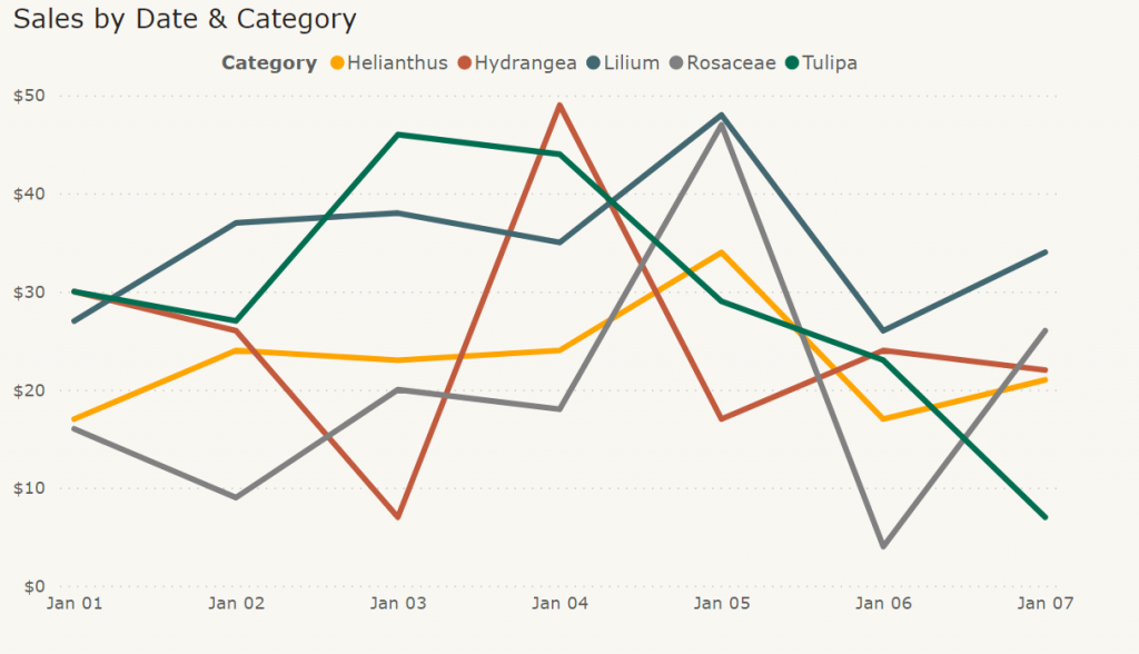
A good place to begin thinking about data-ink is to consider, “how would I draw my visualization if the ink required was truly expensive?” This is a strange thought in the age of embedded analytics and interactive reports, but just as programmers needed to economize their code to run on early computers, it is useful for us to consider how we might similarly economize our visualizations. By treating data-ink as a precious resource we can pare down a visualization to the bare minimum needed to convey the core themes of the analysis, and only then add extra elements to further clarify our story. The following line chart may lack the bells and whistles of more complex visuals, but information is immediately available to the viewer while still being aesthetically pleasing.

Graph of sales by date & category
An exercise I personally use is to start with old-fashioned pen and paper. Take what you know about the data in your mind and draw the simplest picture you can that, when glanced at, conveys the central theme of that data series. Test this several times, trying out several variations, then test your sketches with colleagues. Can they glance at your visual and quickly grasp the message? If the answer is yes, then congratulations! You have found your starting point. If the answer is no, then continue to iterate, starting with simple additions and working your way up to more complex elements. Be careful to not take this exercise too far though, in the case of visual representations, less is more. And remember, ink is expensive.
Parallelism, showing differences through similarities:
“To be truthful and revealing, data graphics must bear on the question at the heart of quantitative thinking: ‘Compared to what?’”
One of the most powerful yet under-appreciated modes of visualization is the use of parallel structures to highlight variation within data. Showing multiple partitions of data side by side with the same chart format is a deceptively simple way to trick the mind into seeing differences hidden in the numbers. To understand why parallelism is so effective, we need to briefly consider the Gestalt psychology of Max Wertheimer. This branch of cognitive psychology deals with the human perception of groupings and patterns. Gestalt psychologists state that humans perceive whole patterns and groupings, rather than the individual components that comprise them. From the study in this area, psychologists developed seven Principles of Gestalt Perception, one which is the Principle of Similarity. This principle posits that similar objects are automatically grouped together and compared when they are in close proximity. This observation is the key to why the small multiple chart (or any other chart that takes advantage of parallelism) works so well. Tufte has also pointed out that by learning the rules of reading one chart, the rules of reading each subsequent chart is unlocked, leading to less mental “processing time” to get to the insights.
Refer to the following example of the small multiple chart. Reading from left to right, we can quickly discern the rules (date on the x-axis, sales on the y-axis) from the first chart and carry those rules through to the remaining charts. This format, the fact that these charts utilize parallelism, allows us to rapidly gain insights and see the differences in the data.

Graph of sales by date & category
Many data situations can take advantage of this principle and is not only limited to sparklines and bar charts! A creative example is, again, given in Visual Explanations where Tufte presents a photograph of a large group of people. Picking a specific face out of the crowd using a caption (names right to left, top to bottom) would be difficult here. Instead, we are offered a type of visual “map” that allows us first to pair a name to a position, then a position to a face, cutting our comprehension time down substantially.
As I noted earlier, the discussions above are only a small selection of how to best visualize data. The points about data-ink, chartjunk, and general use of graphics are universal, but more niche situations will call for creative and thoughtful visualization methods. Edward Tufte, while prolific, is not the only expert in this field and upcoming entries into this series will discuss alternative approaches, interesting strategies and techniques, and new thinking in how we communicate our findings to the broadest range of people. So, tune in to upcoming quarterly releases from myself and the rest of our BI practice area at Verstand AI. If you are at all interested in how you might build these principles into your reporting structure and effectively communicate data science findings to your stakeholders, feel free to reach out to me directly (rjennings@verstand.ai), or through our Contact Us page. Until next time, we look forward to hearing from you!
At Verstand, we strive to help clients make the most of their data. If you’d like to learn more about how we can enable your analyst workforce, please contact us at insights@verstand.ai.


